Colour Part 2 Project

This was the second part of the Colour Project. We had the chance to do something more Graphic Design and design and create an educational book. Inside the book it needed to involve Colour Theory, Symbolism in Colour, Colour Use in Art & Design and Colour Techniques. This took a lot of research in how to design a book and research into type, layout, etc. From this I wrote everything that was going into it and designed each page. It was a challenge however, I enjoyed it and think it helped me to develop my skills.


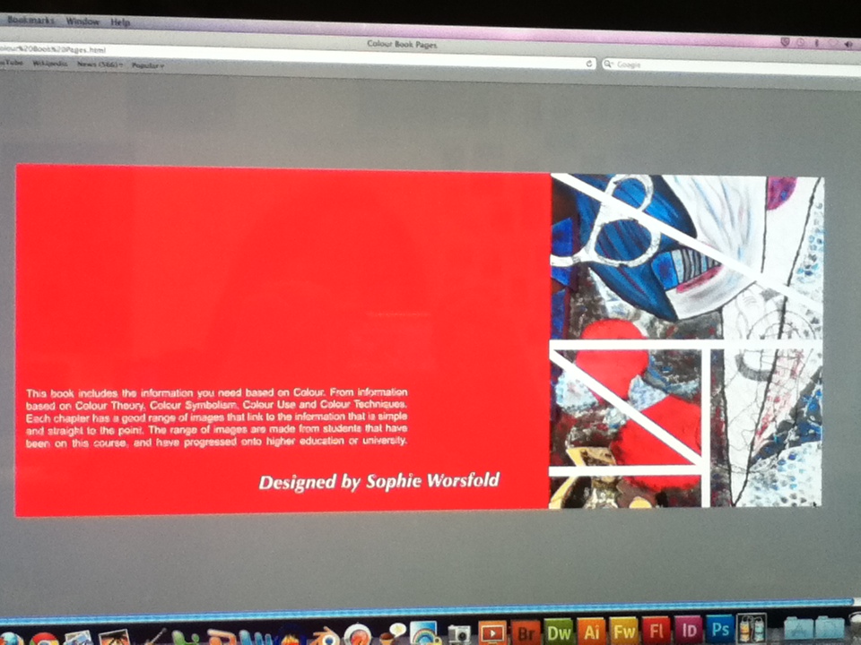
These are a few pages of my book that I created, the back page, chapter and information page. I have tried to make sure that everything is equal to each other.
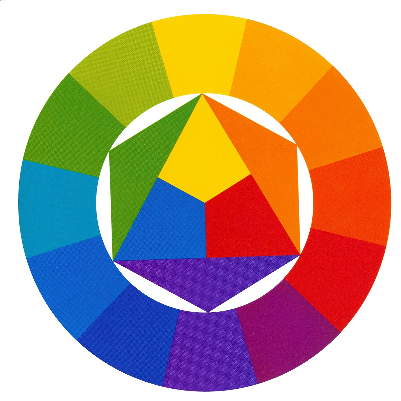


These are some of the images I used in my book, which helped me to show what I meant with Analogous colours, Primary, Secondary, etc. It also helped to jog my memory on which is which and what they mean.


These are the types that I experimented with and I also experimented with the colours that I would like to use in each chapter. These are the main colours that I think will look more professional and attract students.


These are the quotes that I was looking at to add into my Chapters. I love quotes and think they help to explain how you are when you don't know how to say it. I feel these quotes would help to explain Art in a new way.
Colour Part 1 Project

For the second year we started off with this project. Over the summer we had an A5 sketchbook to draw anything we wanted to as long as it had colour involved. From these images we had to develop a sketchbook which will get graded. I had to do a range of colour medias such as complimentary colours, analogous colours etc, which is what we learned in the first year. I developed mood pages on each colour, blue, red, green, purple, orange, yellow and black and white, these all having words representing emotion or words representing the colour. From these we then developed ideas for our final pieces. We used the words and artist we researched into to help us develop our thumbnails and final ideas. Then we experimented and edited the final outcomes.


These are just a few of my final outcomes for; Yellow, Purple, Blue and Green.


This is what I created to jog my memory of complimentary colours. I designed this using a still life that was placed in front of me to collect shapes and patterns. I used this design throughout the complimentary colours to see how by changing where the colour is placed how different it can look.


These are the mind maps I created with words I thought of as soon as I think of that colour. I had words ranging from thinks I think of to feelings and emotions that the certain colour makes me feel. I have also added images of that colour. This really helped me to develop my final outcomes and think deeply into words and emotions.


This is a piece done by Sasha Prood. She is an artist I looked at to help me with my final pieces. I loved how she uses fine liners in her work. This was a piece I looked at a lot more than other work for my Green final.

Culture Project.

Culture was the last project that I did in the first year of the course, it was also my FMP. For this project I had the chance to draw many things such as; the London eye, Big Ben, the streets of London, Graffiti, people walking around and more. For this project I only had to create one piece, seeing as I was concentrating on Graphics only. I visited London city to collect all the researched needed, and also, Tate Modern. I then researched artists to help me develop my book and help me think of ideas for my final. For my final I created a Poster to show the Tate Modern Gallery and to get people to visit an exhibition. I created the piece using card, with a mixture of watercolour, fine liners, card and tracing paper.


This is what I drew while being in London. I drew a mixture of things onto one page, as I found the odd thing interesting and wanted to experiment with watercolour and fine liner. I layered the images over each other and used water colour on only three pictures to make them stand out from the other.

I drew this door because there where many like this around London and I found them intriguing, as living around Wigan you don't find many doors like this. I used watercolour for this and fine liner over the top to add detail with.

I have drawn these guns because I wanted to see what it was like to draw something that I'm not used to. I drew it from the artist BoomArtWork, who I was very inspired by. I used a black ball point pen to draw this at first as I wanted to challenge myself, and with pen I wasn't able to rub it out. I then went over it with watercolour to add colour and make it more interesting.


This was an idea I had before I pushed my ideas further to get my final piece. I wanted to use the cup because I feel this is a common stereotype that people from other countries put onto us, that we drink tea all the time and eat cakes. I thought this would be a good idea with the type in the middle. I used water colour, acrylic and fine liner.