Mechanical Project.

Mechanical was my second project which I did. I created four finals, each for the four disciplines; 3D, Graphics, Textiles and Fine Art. I visited MOSI (Museum Of Science and Industry) for primary research, which helped me create and develop ideas. For 3D, the starting idea for a final I had to create was based on kitchen ware. I made a list of what I would like to create and then chose which I would like to make. I decided to create a tea bag holder and sugar and coffee pot holder with a spoon. For Graphics, the idea was to create a poster for the MOSI Museum, so I decided to link the poster with images I drew from MOSI, however, with this I had to make sure that I made it for the target audience. For Textiles, I created many samples based on the shapes and images from the primary research, from these I looked closer to the detail and created four pieces of work. For Fine art, the final piece was to be a lino print based on the techniques from Stuart Davies. I printed with a range of colours and onto a range of different sorts of papers.


I created these to help me decide if the size that I wanted the clay pieces to be, where the right size and not to big or small. I think creating these really helped me and would create a sample piece first next time if I were to create a 3D piece.


I created this to have an example of an artists work. I used ink and mechanical pieces to help me decide which would work the best on my final piece. Doing this was a lot of fun and I would like to use ink again for my final again soon.


This is the lino which I used to print onto paper, newspaper, card, etc. I used many colours which helped me decide which worked best on which material. I found it hard to cut the lino, but once I got the hang of cutting it, I found it quite easy to do.


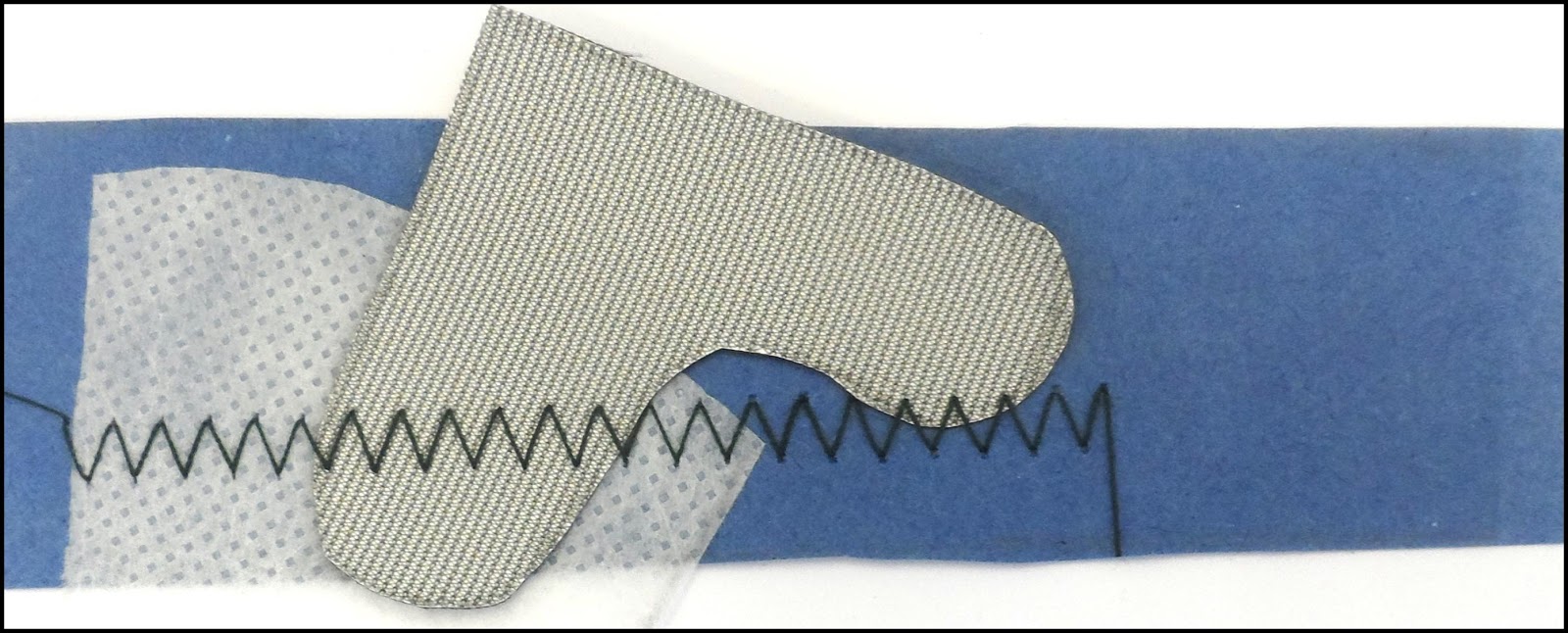
For Textiles, I experimented with some samples. For these samples I used a range of fabrics and stitches, which helped me to decide which fabric would be best to use for my finals, and which kind of stitch would make them look the best they can be.

Formal Elements Project.

One of the first projects I got given was Formal Element. From this project I learnt a lot about Art and Design and first started to develop my skills. I had the chance to learn about each formal element; shape, form, texture, colour, line, pattern and tone. When starting my work I looked at a still life which was full of different shapes, colours, lines and patterns. Then final piece that I created was a canvas, with all the four disciplines added into it. For 3D, I created a clay piece full of texture, line, pattern and colour, and also I created a wire piece full of line and shape to add to the canvas. For Textiles, I created a screen print, made from shapes with added stitch, this then was applied onto the canvas and I added padding underneath to add volume. For Fine Art, I painted and layered the canvas background to have a starting point to add on, I used gouache and acrylic paints and also newspapers and foam to add texture. For Graphics, I created work onto the actual canvas by joining the letter 'Brush' together to represent a continual line. I also had a letter 'B' that was filled with pattern then applied on the canvas.


This piece was created using Clay. It was added to my first final piece, which made the canvas look more interesting. I used many tools to create texture and shape to the piece. I have also made the piece bend so it comes off the canvas and creates a better look to the eye. 


This piece was created using screen print and inks. I used blue and pink because I feel that they worked very well together, and the mixture of them both created a deep purple which I find interesting. I then added french stitching and cross stitching to some parts of the shapes to add some detail. Creating this helped me decide on what shape, colour and pattern I should use onto my final piece.


This piece was created with Gouache paints. I find them very engaging as they are completely different to Acrylic paints, which I use often. I used Rauschenberg as inspiration to experiment with and to use his techniques in my work. The rough brush strokes to me show expression and a hard edge to the piece, while the blue gives a calm look. I used these techniques into my final piece for the background, I found this go practice and ideas of how I could apply the paint onto the canvas. 


This piece was created from letters and words I collected from a range of sources. I enlarged and traced them and added colour, line, shape and pattern to the words. The letter 'D' has more detail to make it dominant the piece and create interests. I used this for inspiration for what could go onto my final piece.